De Doelen (2024)
Seizoenscampagne
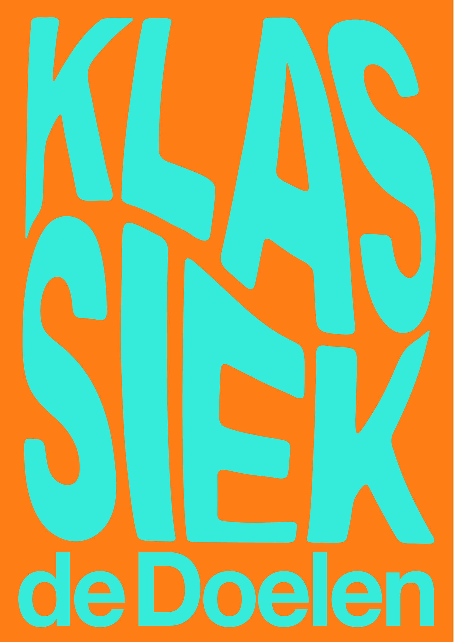
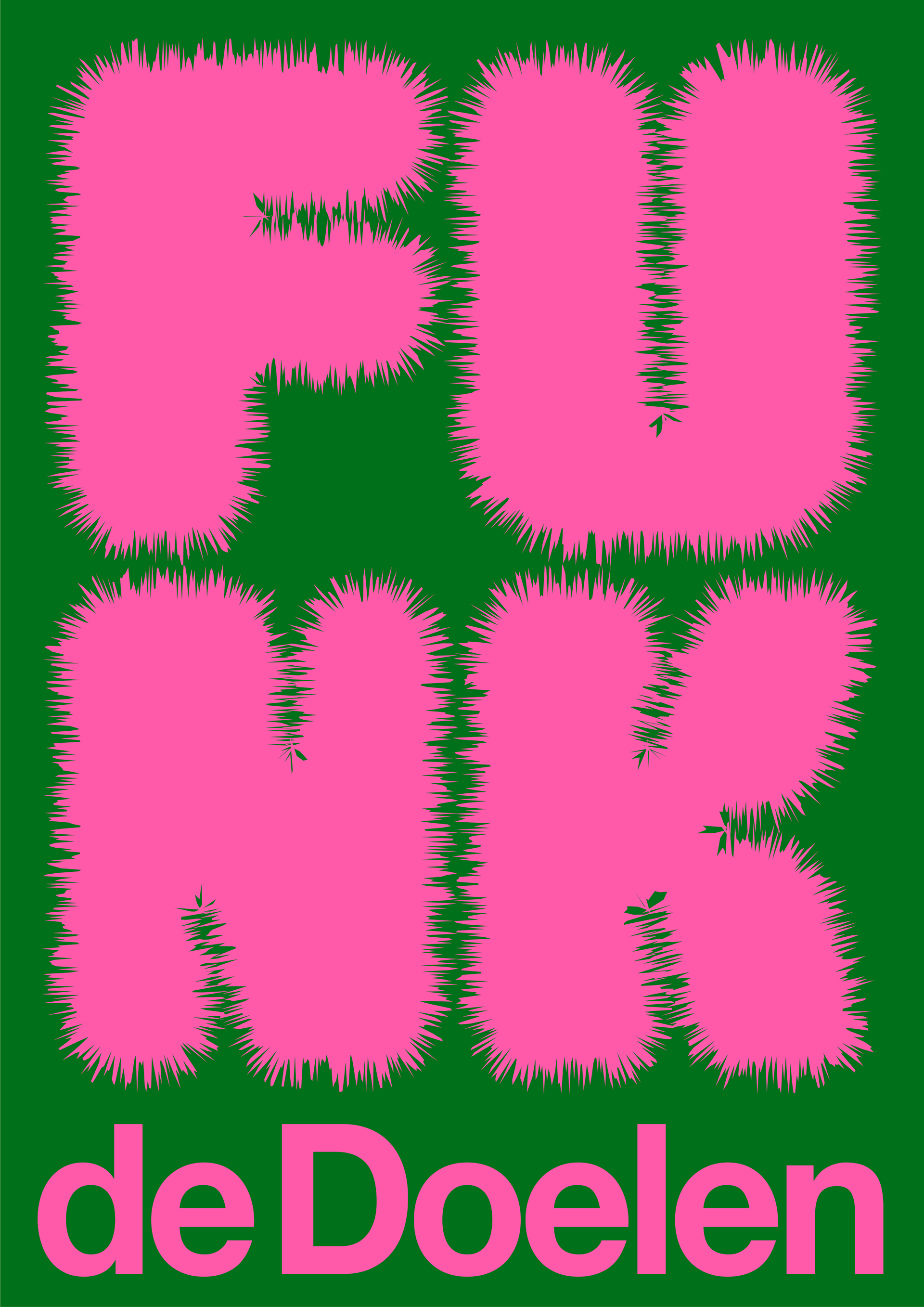
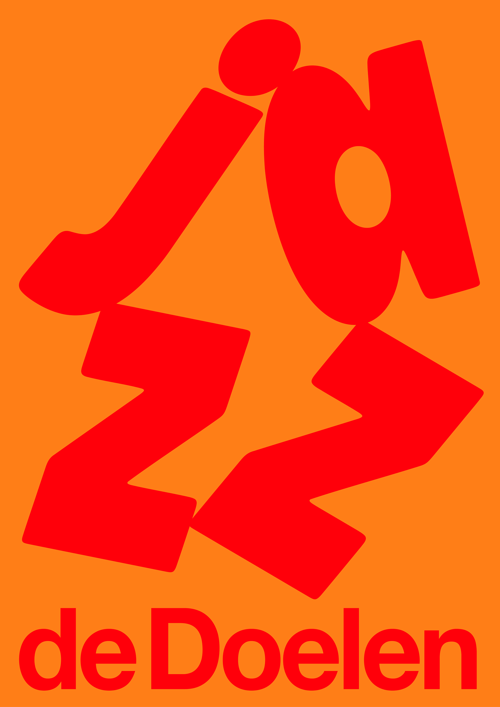
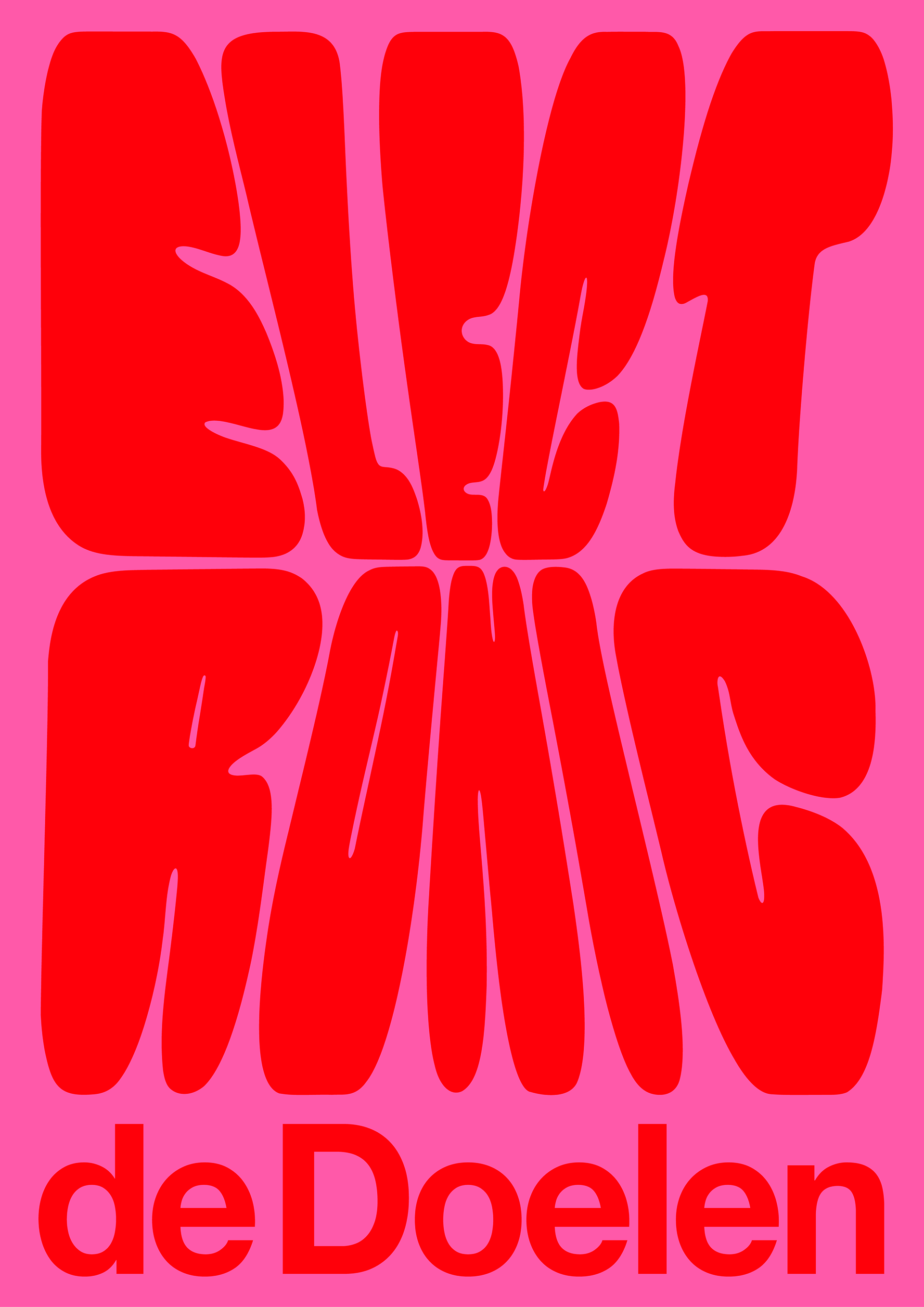
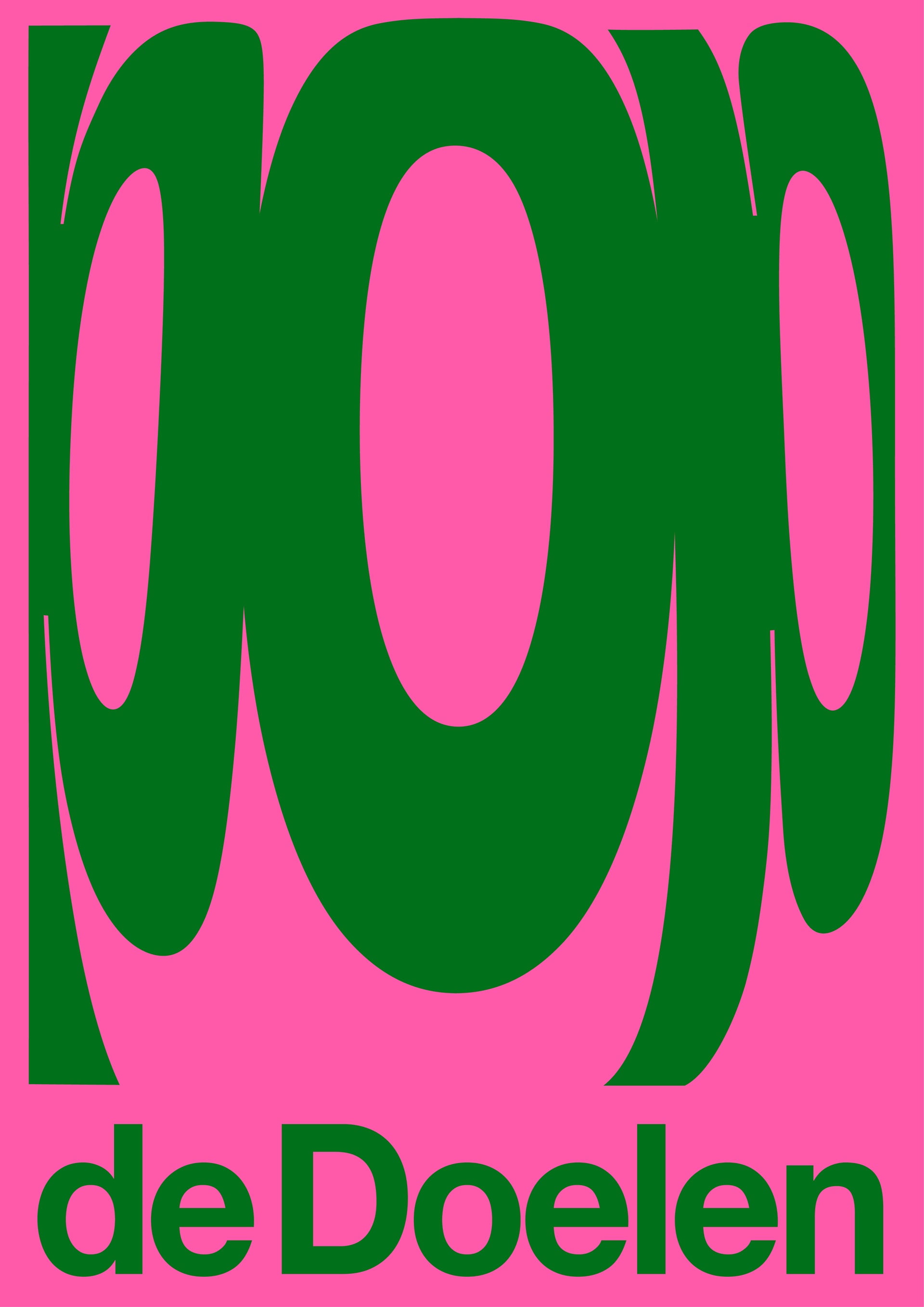
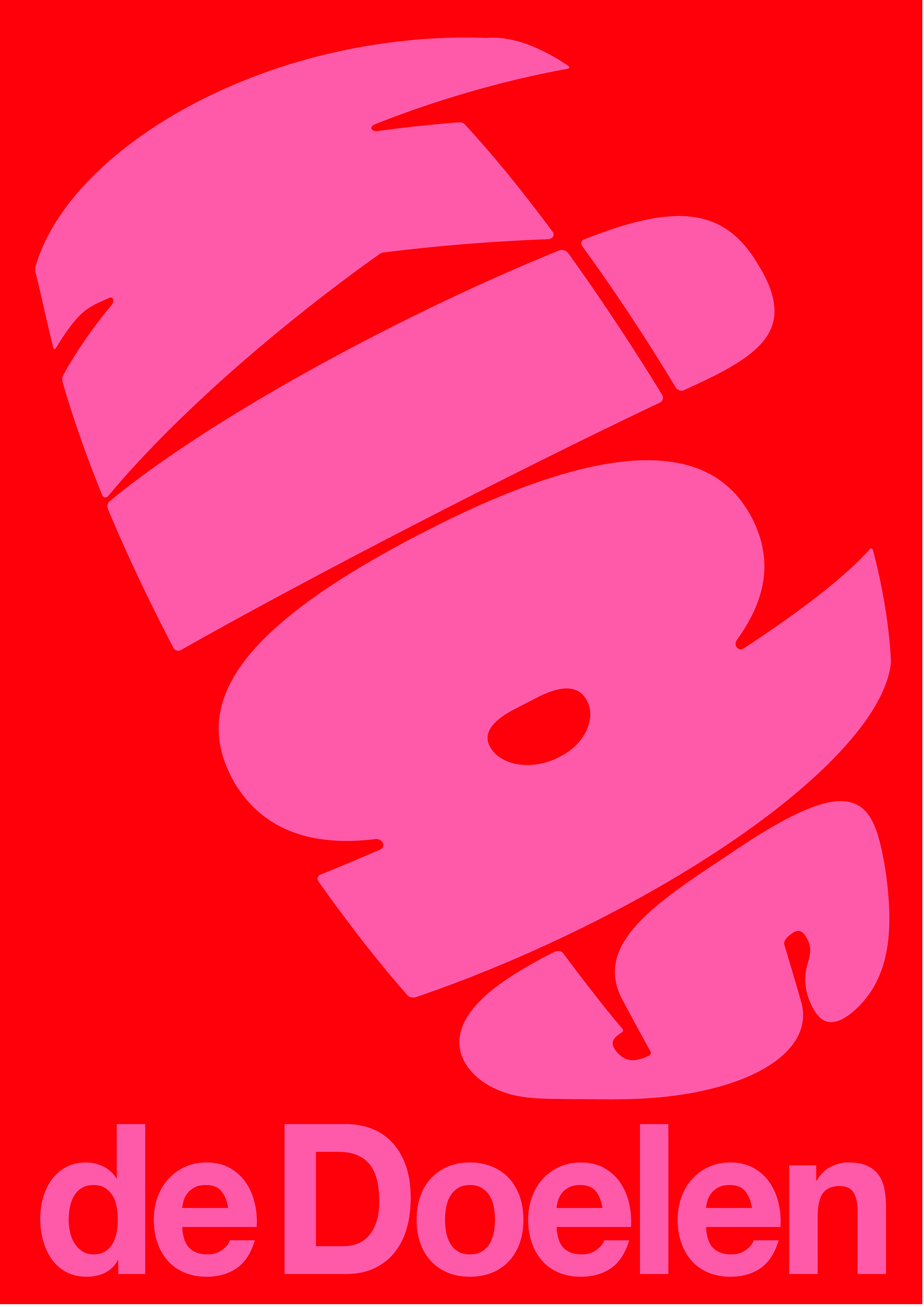
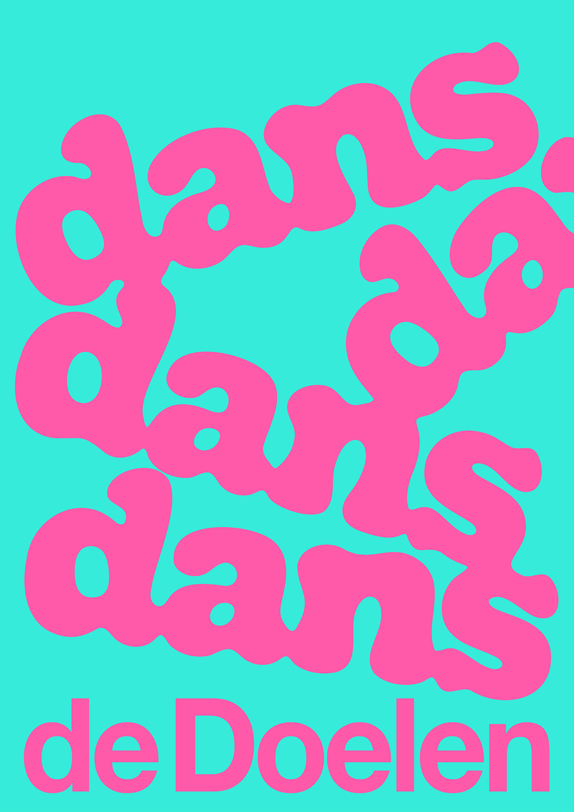
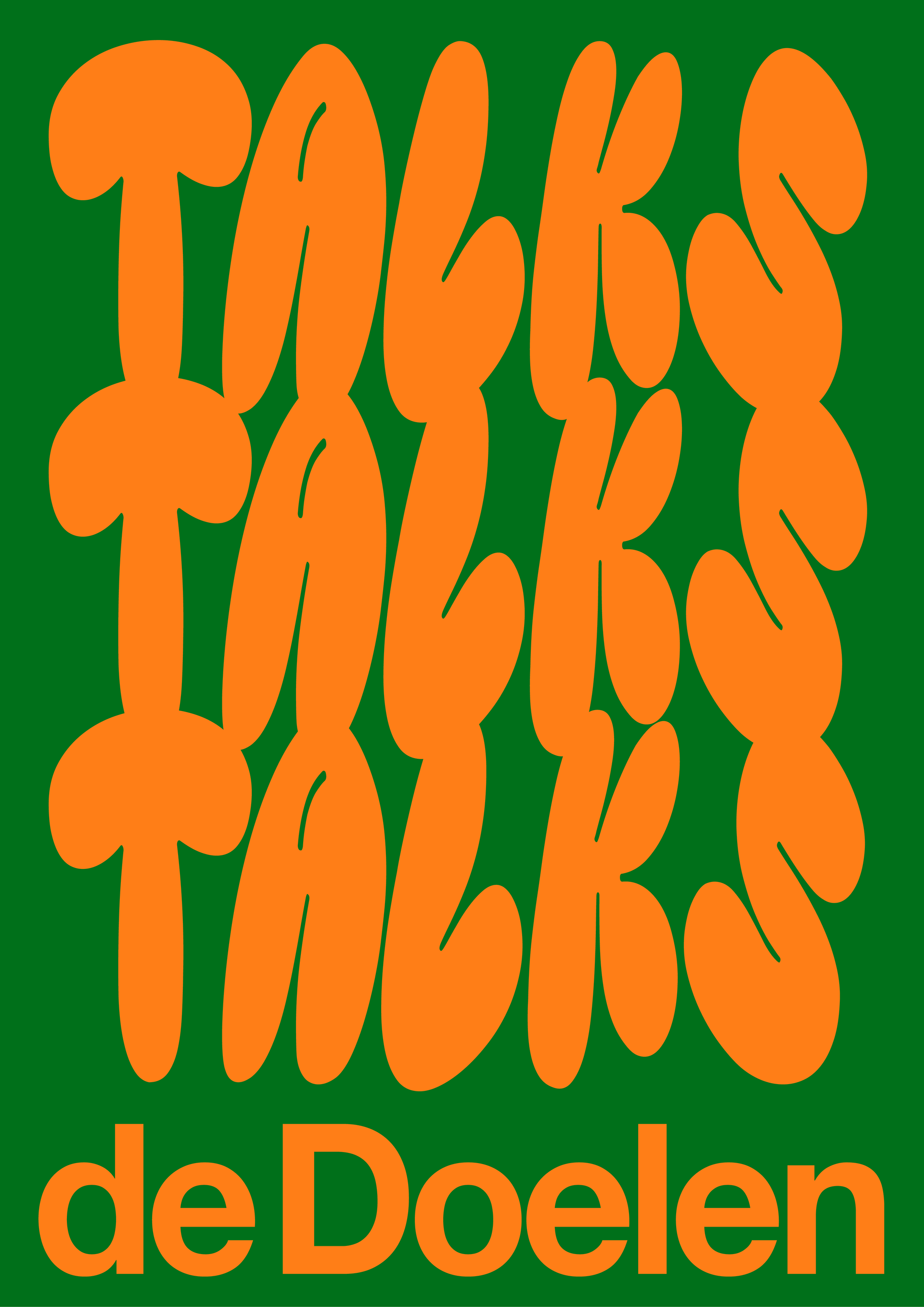
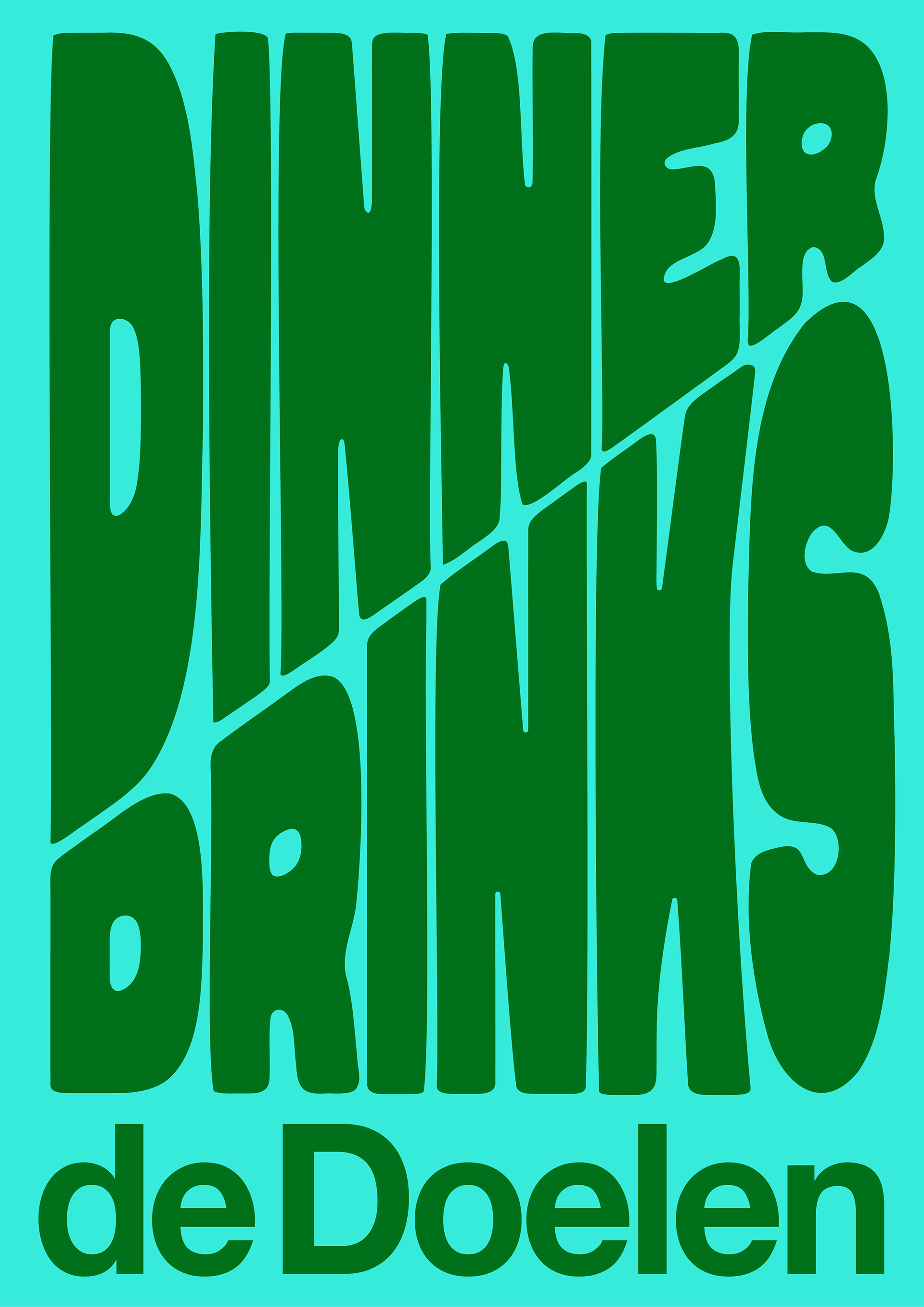
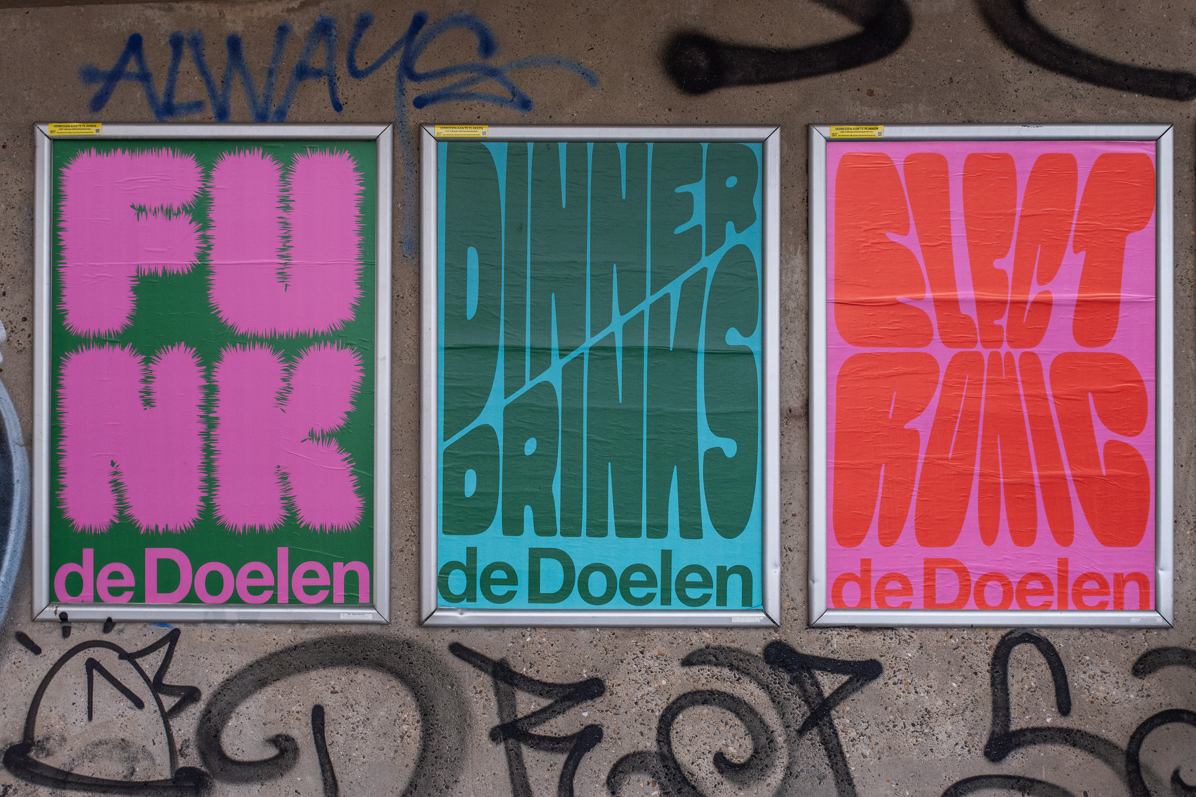
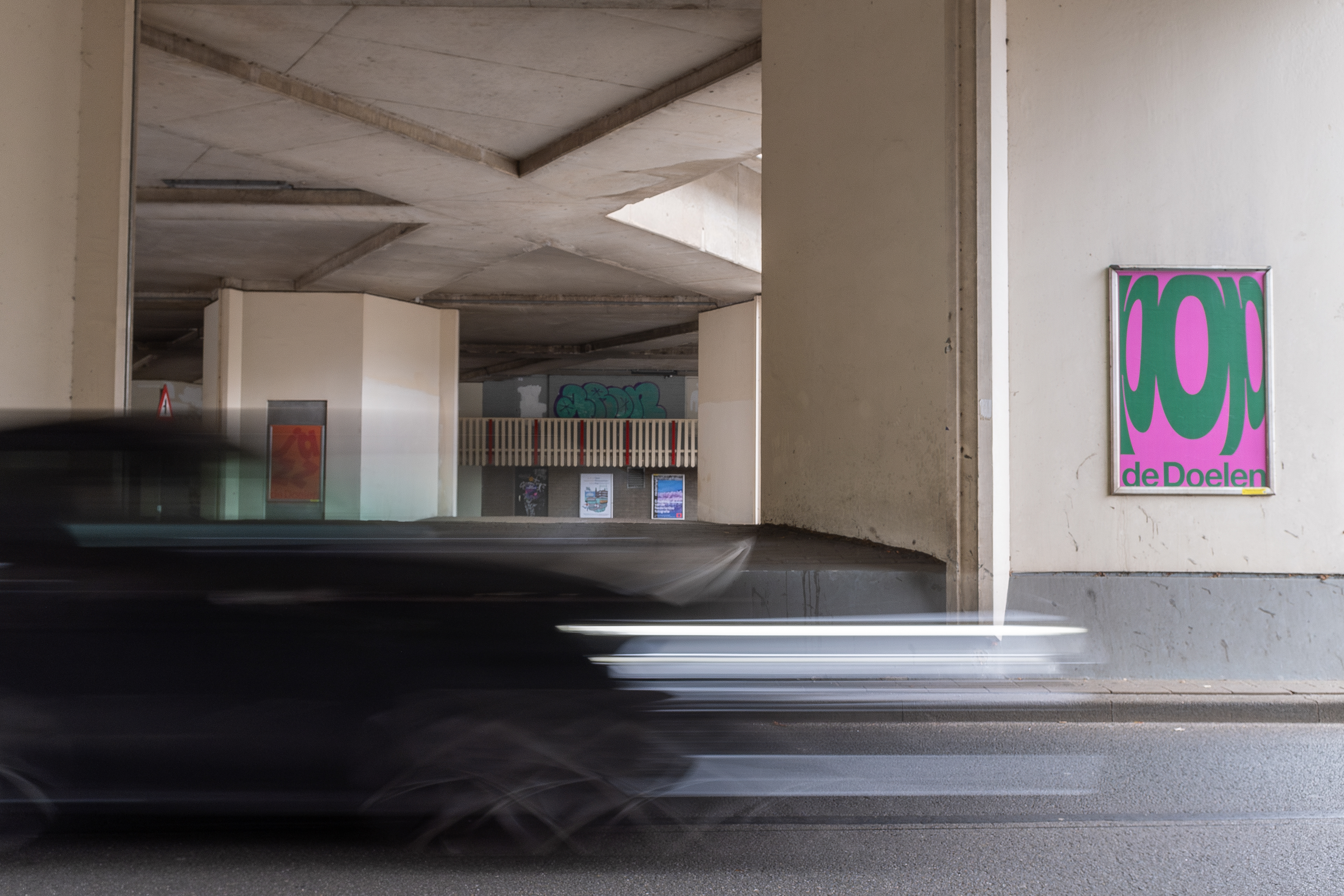
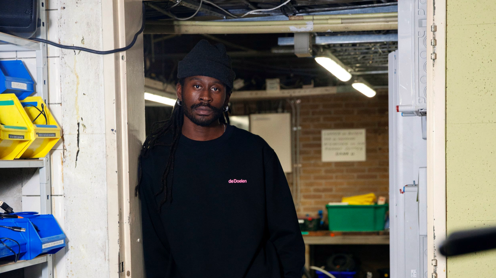
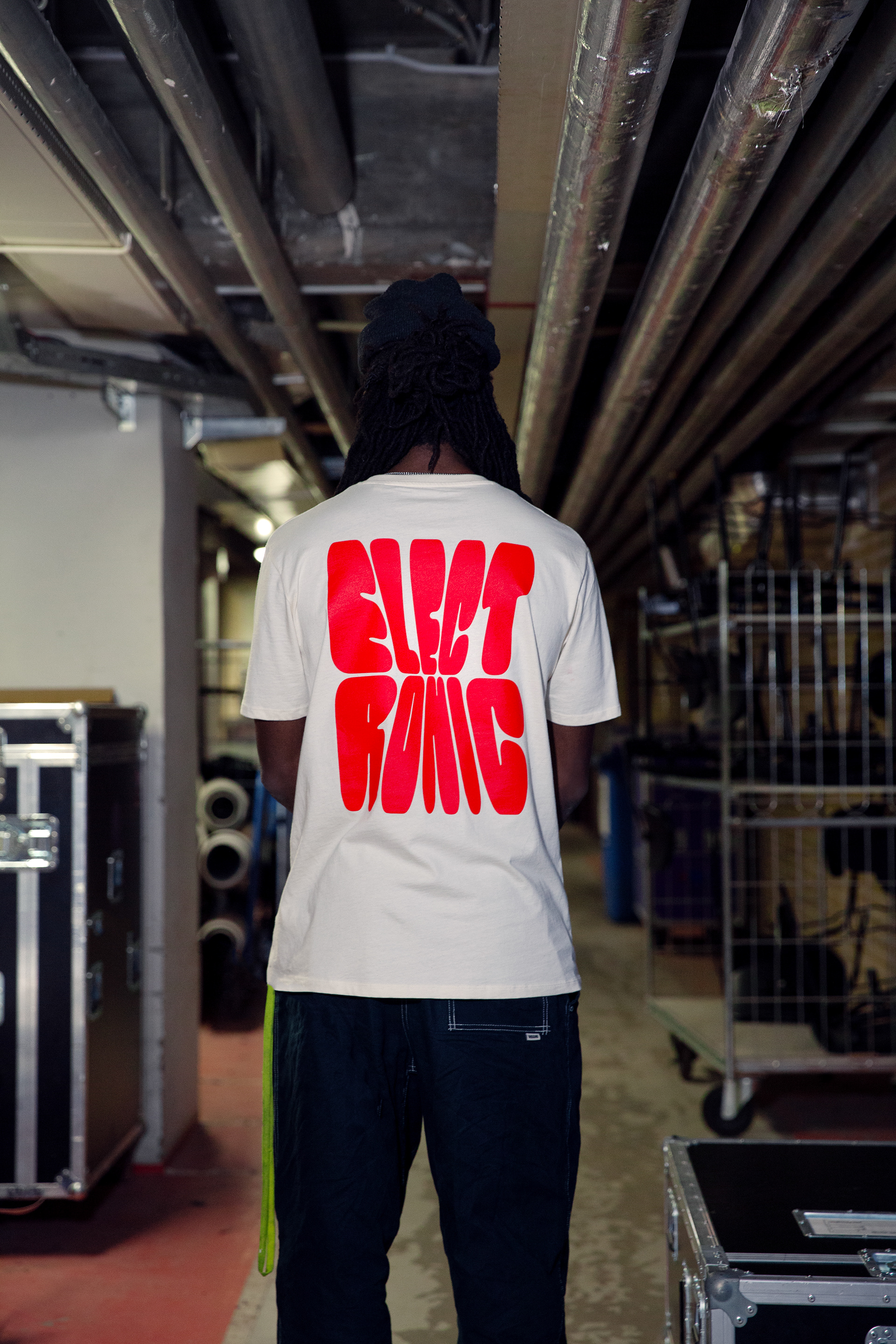
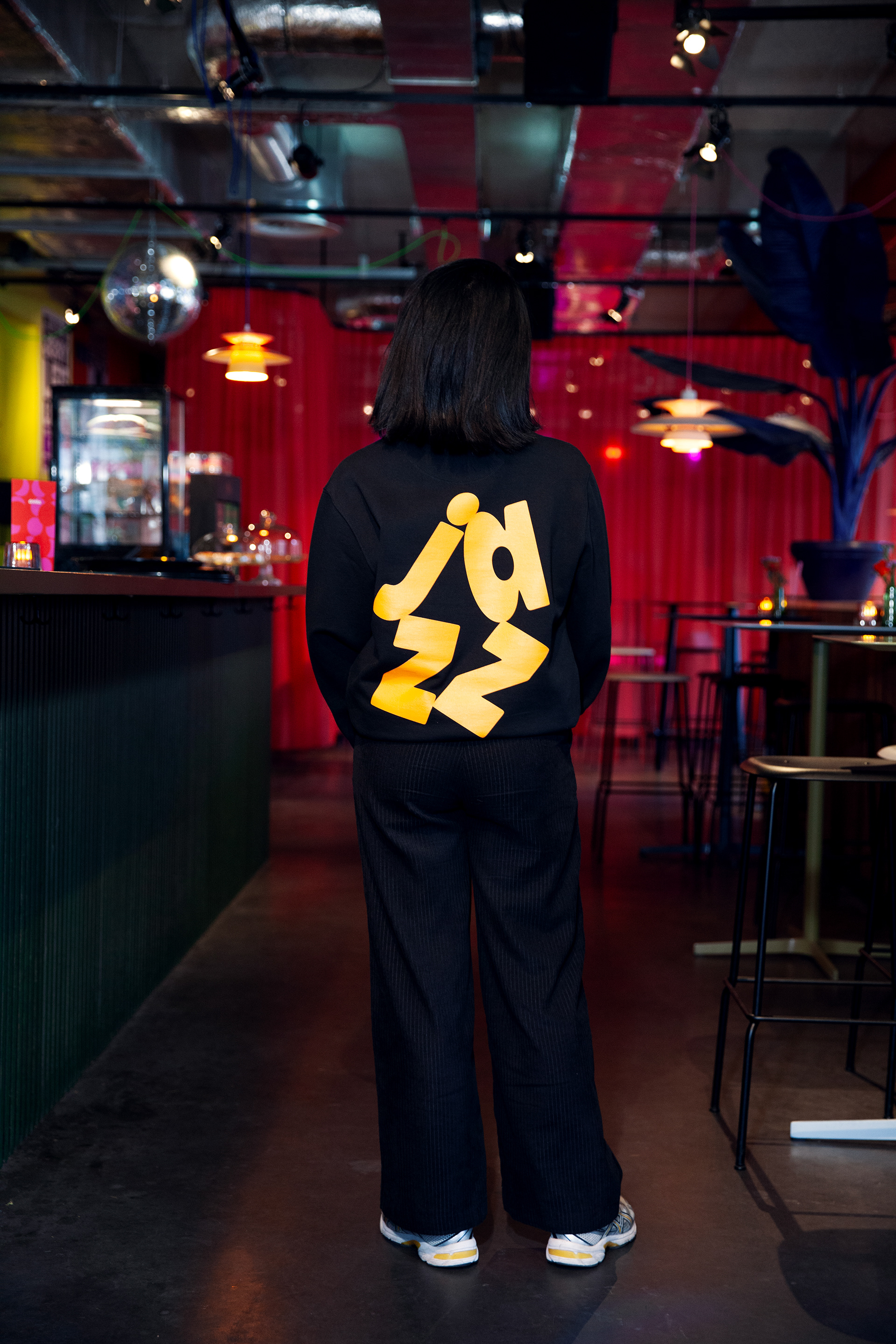
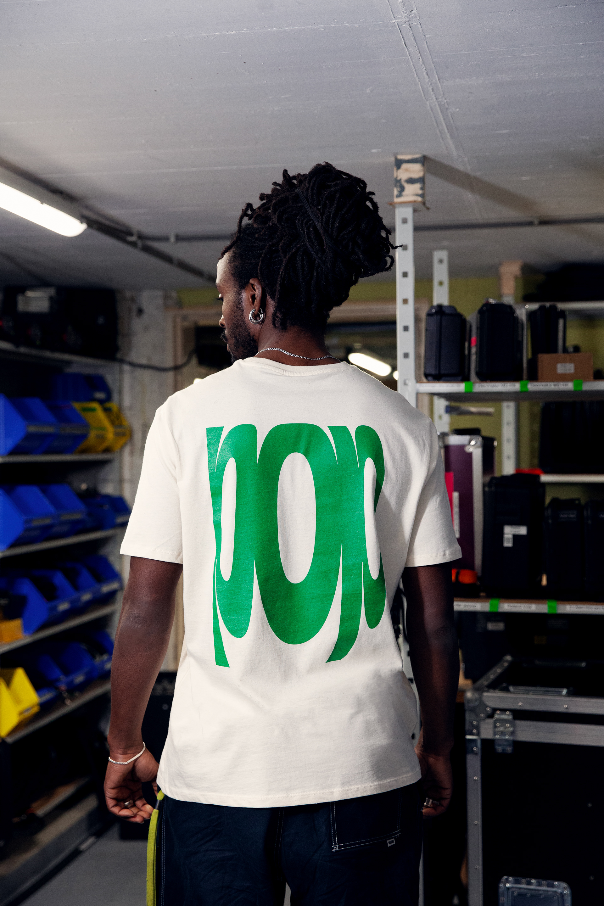
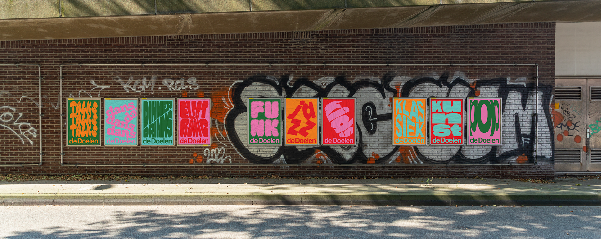
Design for the seasonal campaign for De Doelen that uses typography to express different music genres. Each poster lets the letterforms carry the mood and rhythm of the genre, creating a clear visual identity without illustrations. The concept works across all campaign materials including posters, motion, online assets, merchandise, postcards and banners. It's meant to be a playful campaign that stands out and speaks to a broad audience, from young to old.
Motion by Peter Wojakowski, Photography by Cijille Kurvers.