Touch Me To See Us (2022)
Event & Promo Branding
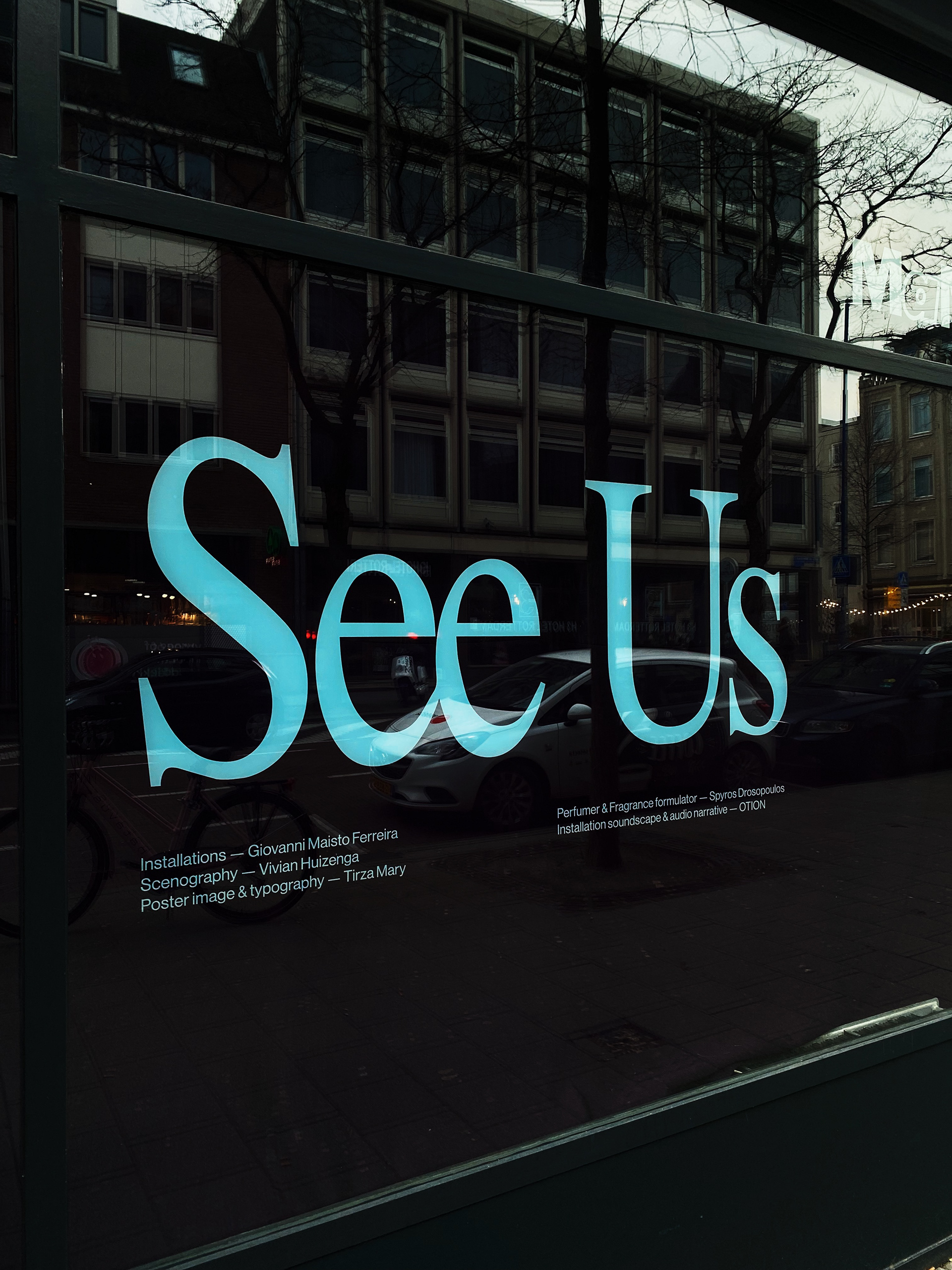
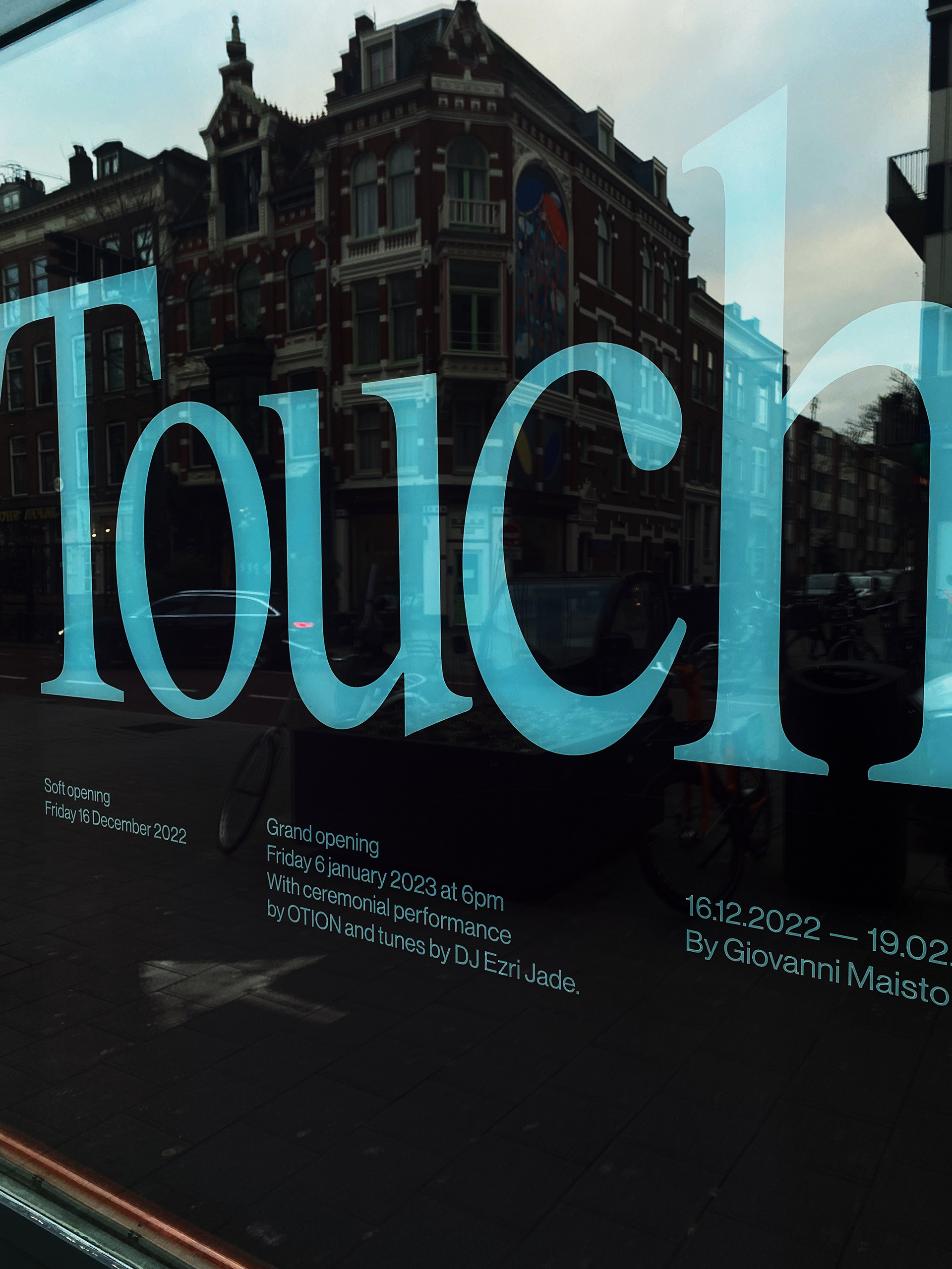
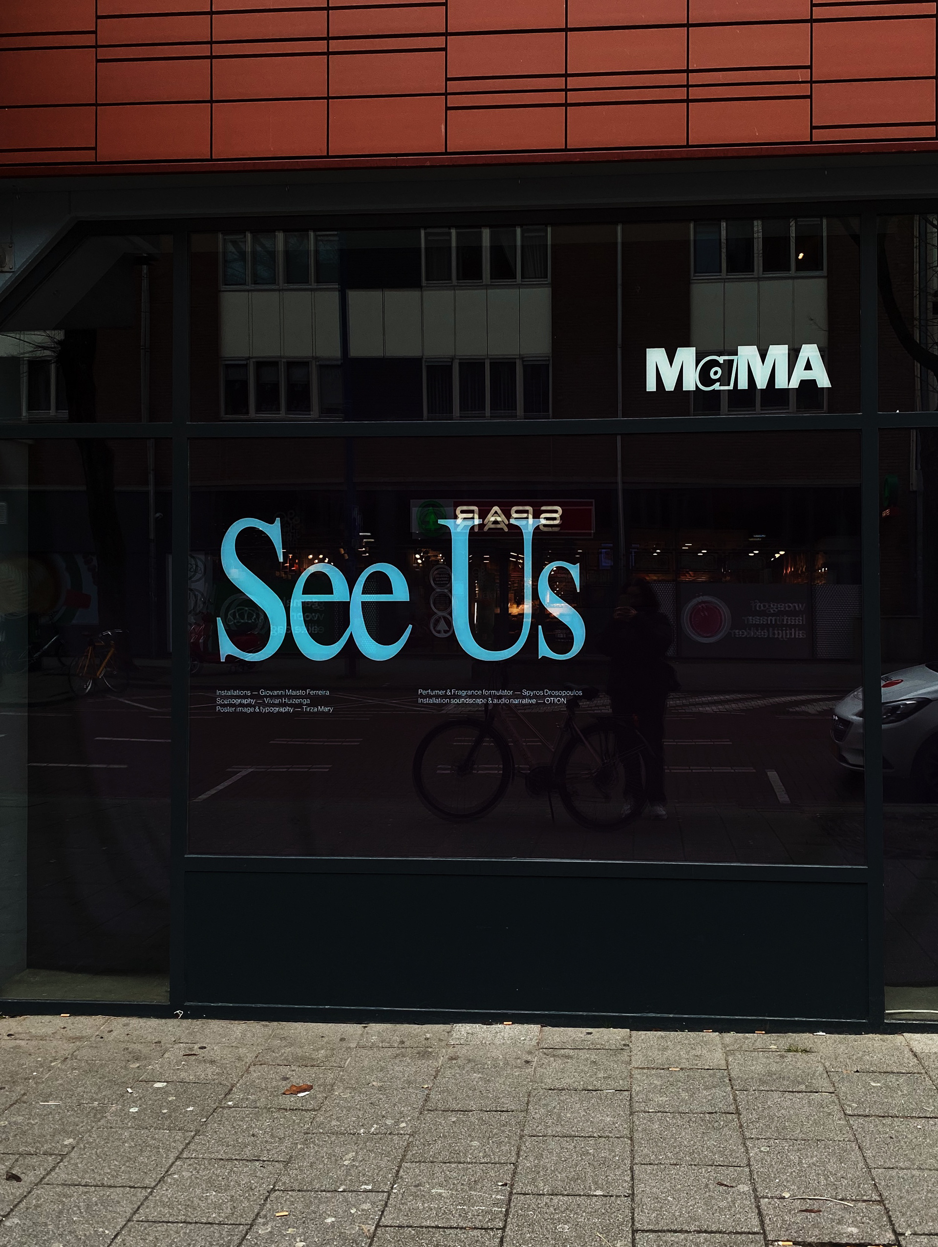
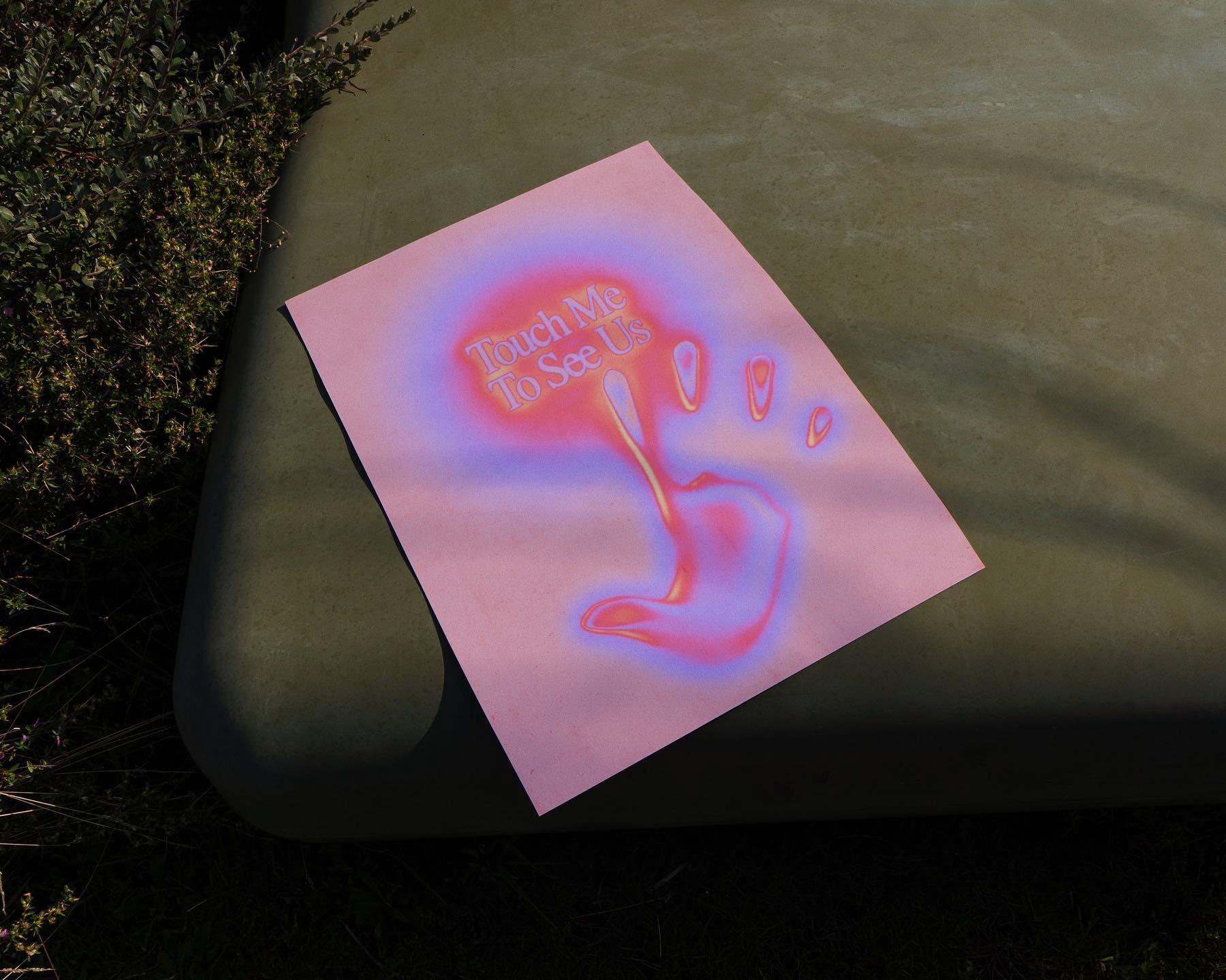
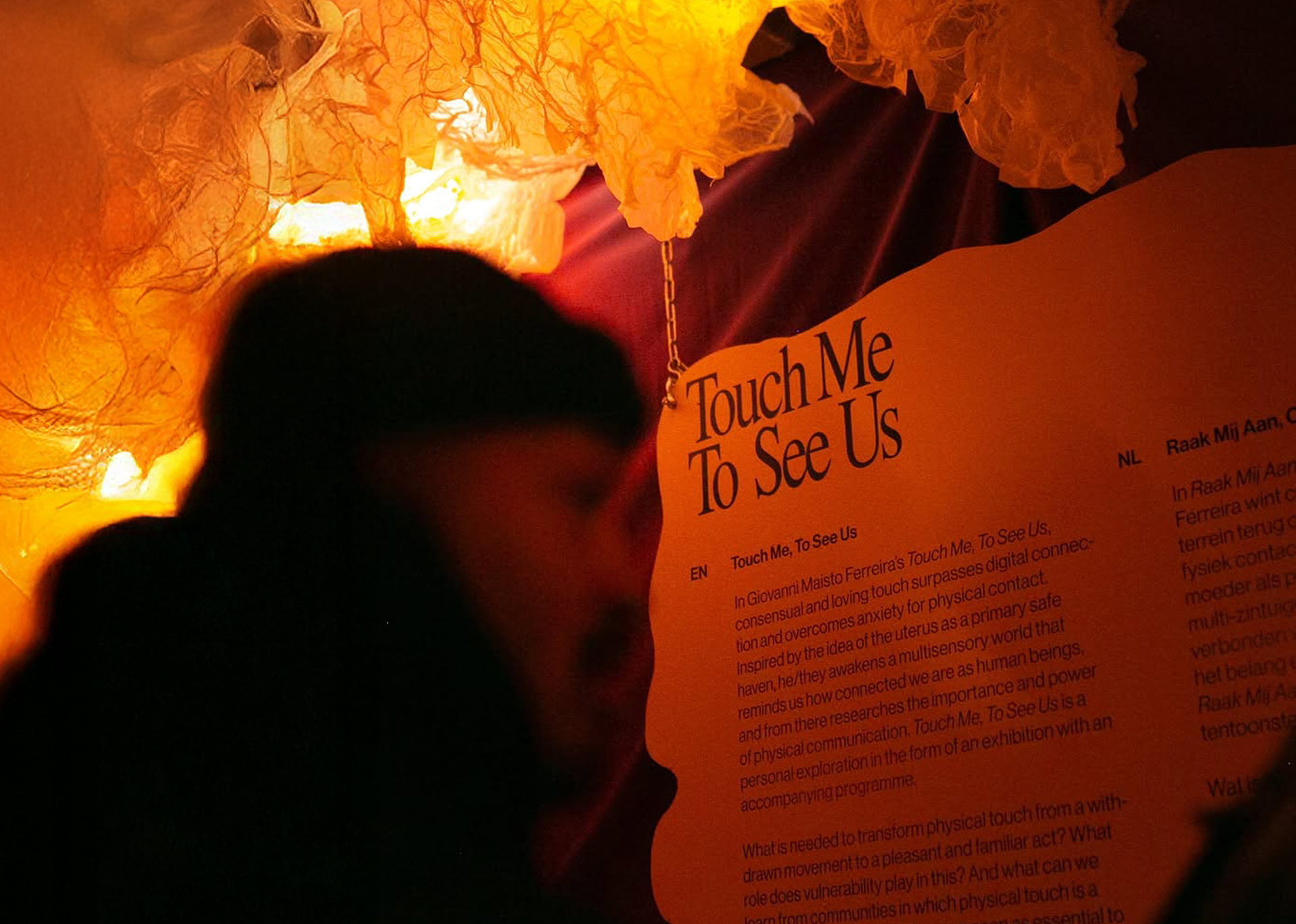
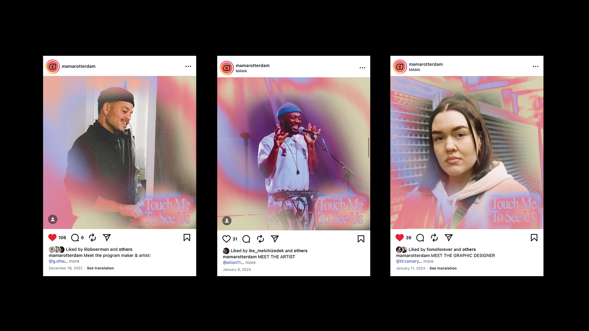
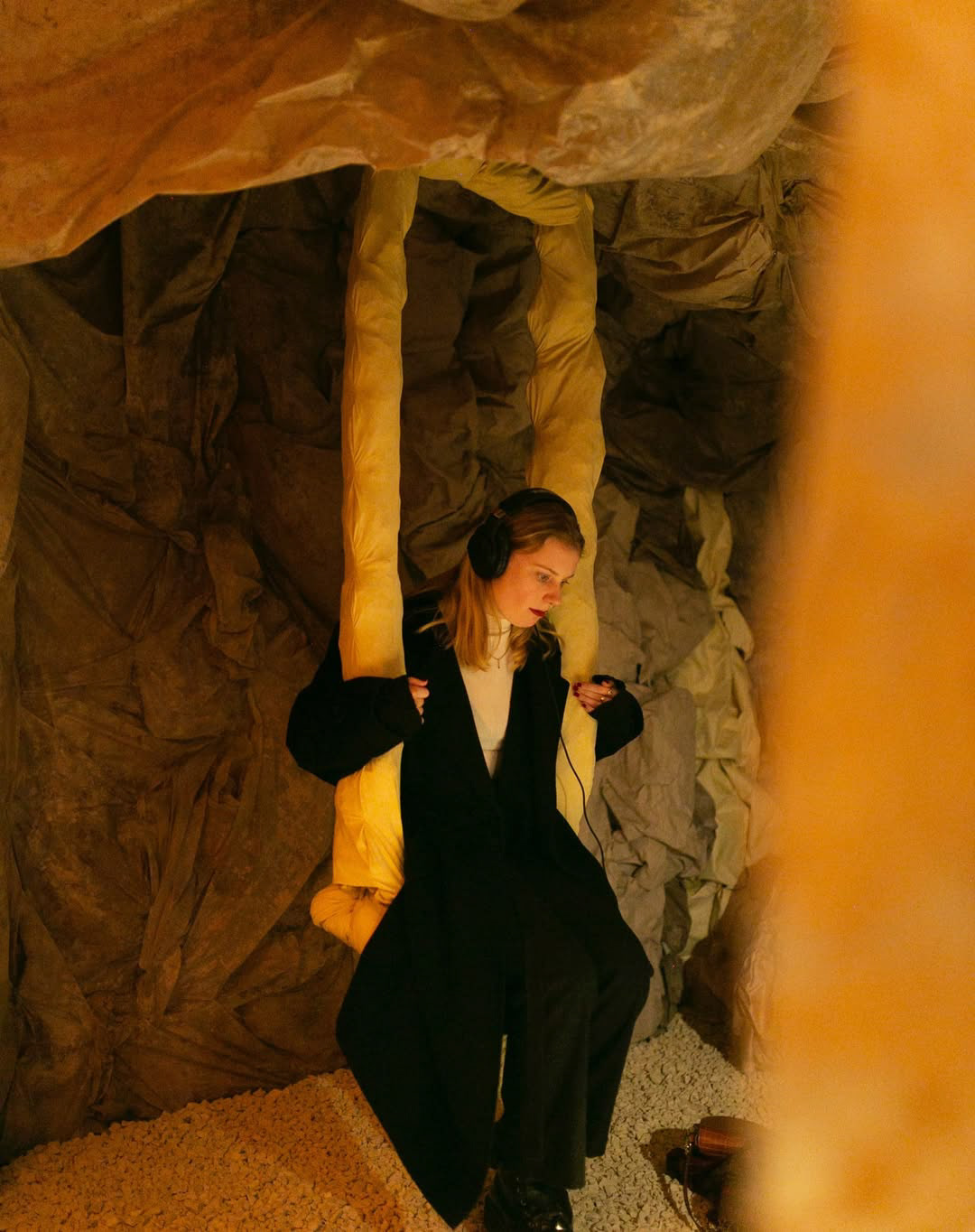
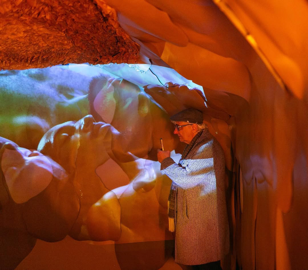
I worked on the branding and typography for an exhibition at MaMa Rotterdam called 'Touch Me, To See Us' by Giovanni Maisto Ferreira. This exhibition aims to bring back consensual and interactive touch in the digital age and address the fear of physical contact. Inspired by the idea of the womb as a safe space, Maisto Ferreira created a sensory experience to highlight the importance of touch.
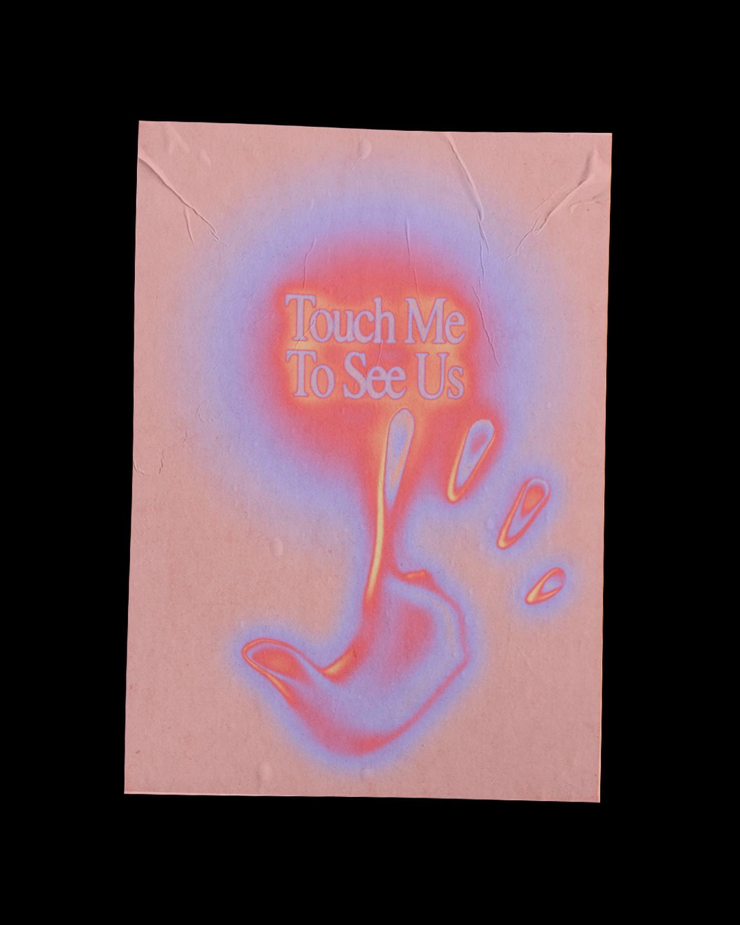
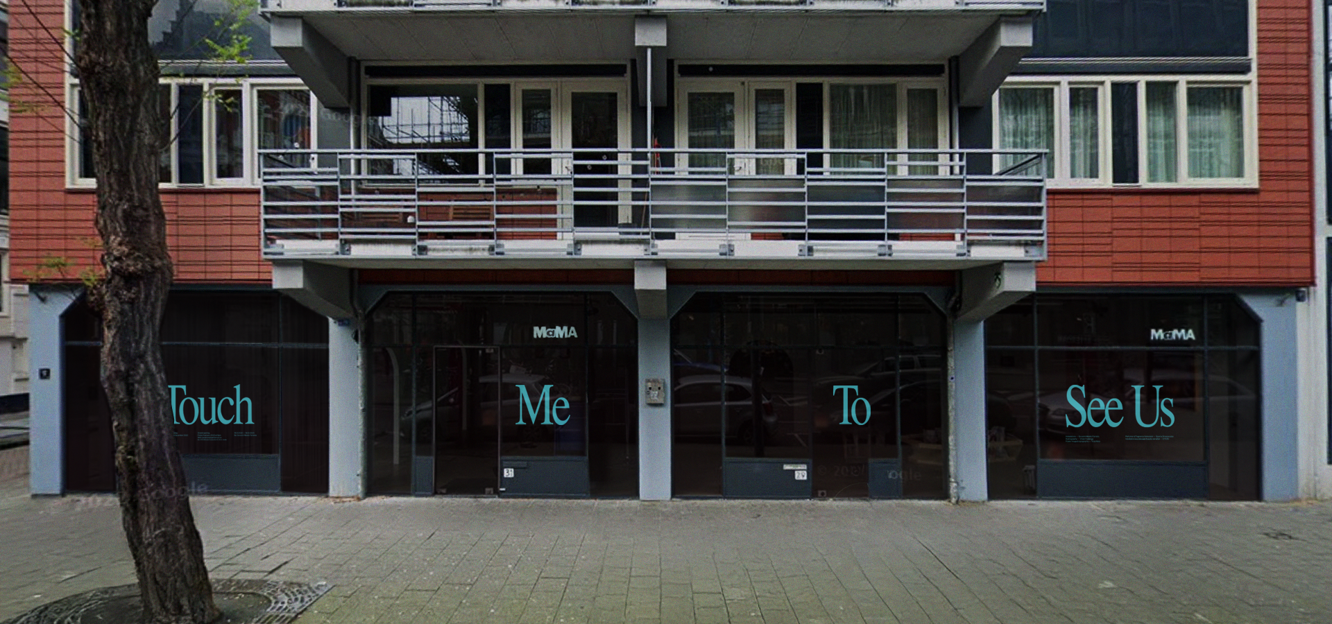
For the design, I used a gentle and welcoming approach. The project required incorporating hand imagery, so I used a hand image edited to look like a thermal camera view to symbolize warmth and the idea of physical connection. After some iterations, we settled on a subtle design with a single hand gently touching the image. I also designed the logo, window typography, and communication boards for the exhibition. The logo uses a classic font to convey the importance of the subject matter while maintaining a friendly feel. In the window typography, I divided the logo into big letters across the windows and used light blue to create a striking contrast with the dark backdrop.